Monday, October 24, 2011

Montage-It!

Task: To be inspired by a few of Eduardo Chillida's artworks to create a concept model, then digitally manipulate a photograph of it into other photographs. We then made a flip book to explore the model's space.


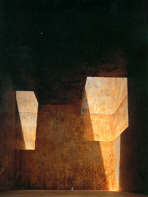
The image which I selected: Mount Tindaya


During the first lesson, I found that the artwork is a cubic cave, 40x40x40m, to be excavated out of a mountain in the Canary Islands. To be, although the space is quite large, it feels like a restraint on freedom. I wanted to invert the light shafts, the solidity of the walls, the location. I wanted to explores 'space' and 'light' as my concept.

At the beginning of the task, I was quite confused at what we were supposed to do and how we were supposed to present the tasks. For clarity, I conducted research and wrote a 1000 word essay to order my thoughts and  justify my concept of 'space'.


My concept model

As I have a long interesting in light, colour, the sky, and space - in terms of both astronomy and "an embodiment of place" ("Art and Space", Martin Heidegger 1969) - I tried to look for photographs that incorporated this kind of atmosphere to manipulated photographs of my concept model into.

New York Central Park at night. The image was taken with a 180 degree angle camera and I tried to conform to the two point perspesctive and lights, and emphasise the size of the model.


Once again, I tried to reflect the starry lights reflected on the perspex.


I thought using a snow image would be interesting as there is a compliment between the stark whiteness and the transparent model.


This image is also the field in Cental Park, however I have changed the scale so that the shape of the model can be seen. As the material is transparent, to make it look realistic, I had to play around with transparency and gaussian blur.

Flip book animation


To reflect the simplicity of the model, and still express realism, I made my poster layout basic and clean.

From this workshop, I have developed skills in photoshop and visually communicating ideas and concepts. I enjoyed this workshop as I was able to be more creative and challenge ideas such as whether 'space' is a concept or not. I found the flip book quite tiresome as it required just slight changes to ensure a smooth exploration of the space. Thus, I scanned in my drawn images and tweened between frames, something I have previously learned how to do in photoshop.

Friday, September 23, 2011

Draw-It!

Task: To hand draw the plans and elevations of the Rose Seidler House and render this according to a theme chosen that represents the house.


Rose Seidler House
http:/www.hht.net.au/_data/assets/image/0004/2974/RSH_Exterior.jpg

When researching about the house, I found that Harry Seidler's parents commissioned this house. Seidler aimed to emphasise simplicity and slight childishness as his parents' son. However, there is an internal feature wall where the geomtric shapes and primary colours contrast with its organic and free flowing lines.

http://blog.selector.com/au/files/2011/01/Rose-Seidler-House-Sundeck-Photograph-c-Justin-Mackintosh.jpg
To emphasise minimalism, I did not draw many lines present on the given plans, such as those representing the timber plank directions. I tried to make all lines and corners very crisp.

In my renderings, I aimed to reveal the simplicity that Harry Seidler tried to convey in the Rose Seidler House.

Presentation of drawings and renderings


North-South section


East Elevation


North Elevation


First Floor


Ground Floor


Axonometric view of East and North Elevations


Draw-It! poster


From the Draw-It! Workshop, I have learned the significance of line weight and thickness and have developed these tecniques to communicate space, emphasis and the 'story' of a house. These drawings provide a scaled diagram for viewers to gain a comprehensive idea of the skin and external structure of the building.


Saturday, August 20, 2011

Model-It! Week 3

Task: to construct a 1:50 detail of the window seat in Louis Kahn's Fisher House


My model representation

North East corner. The seat is inserted into the 1:50 model of the complete model


Task: to construct the Fisher House on a 1:50 scale.

South-west facade


East facade

I chose to cute out the individuals panels for the windows to show the change in grain line, and also to show how some pieces have different thicknesses and recess slightly. This was quite time consuming, and I know that most other students just cut squares out of the wall for the windows, but I found that my method made the model look a lot better.


Detail of connection between cubes


Task: to compose a poster promoting an exhibition for Model Making


In the poster, I aimed to show the final models I had laboured over for the past few weeks.


Prior to this course, I had no experience in model making, and found the tasks quite interesting. As I studied Visual Arts in high school, I had had some experience with using a cutting knife and cutting boxboard type materials. From model-making, I have learnt how models provide an accurate representation of the shape, space and size of a building. The model can be viewed at different angles and also thus provide information on site orientation.

Model-It! Week 2 - Take home task

Task: to construct a 1:50 site model of the Fisher House (Louis Kahn)


 Fisher House  By showing the layers, I reveal the contours and the solidity of the earth. I chose to use boxboard for the earth and balsa wood for the house to show the difference in materiality.


Monday, August 8, 2011

Model-It! Week 2 - Studio

Task: to "sketch" through models.


To show the M peak, I started off with something simple. All the extra smaller components are off-cuts from the same square I cut the larger two pieces off.

  
From the front, the M peak can again be seen quite distinctly, however the pieces converge at the back. When photographing this model, I found that the lighting cast a geometric arrow shape.


Model-It! Week 1 - Take home task

Task: to construct a 1:100 model of the Barcelona Pavilion


I was quite pleased with this model as the tutors said that it looked like a "diagram".

I referred to the following diagram to aid me in construction

http://bryndakirk.files.wordpress.com/2008/12/section_cut-barcelona-pavilion.jpg


Model-It! Week 1 - Studio

Task: to construct two houses, one from balsa wood, the other from boxboard, with base dimensions approximately 80 x 80 mm
One side of the roof has yet to be placed. The other house was similarly made, however I made cuts for windows on the walls and the roof.


Task: to creatively combine the two 'houses' made in Week 1 Studio


I wanted to show the differences in materials used to make each house. At first I thought it would be interesting to place the heavier house made from boxboard above, but I couldn't make it stable, while giving it a sense of weightlessness.


From this angle, the gap between the houses emphasise materiality differences, yet the ladder connects the repetitive form.